Below are some graphs showing the tremendous changes in human mortality, and some of their possible causes. Print-quality versions of these graphs are available if required. Other publicly available material for download can be found in the library and on our blog.
Mortality Transformation
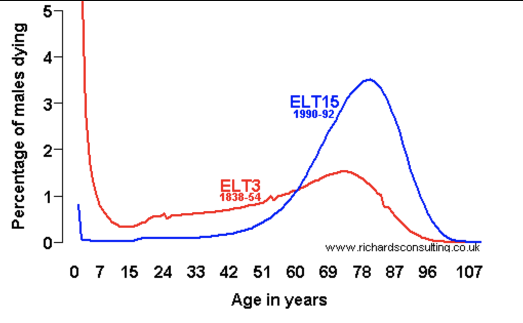
The past 150 years have seen a transformation in human mortality in the developed world. Mortality has changed from being a feature of all ages, particularly for infants, to being very much a phenomenon of later life. Source: English Life Tables. ELT3 figure at age 0 (not shown) is 16.4%. These curves can be explored in more detail using our online tool.
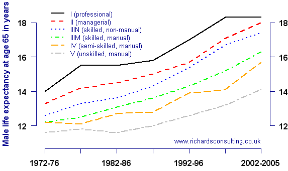
Life expectancy in retirement by socio-economic group
Life expectancy in the United Kingdom has increased steadily over the past thirty years. Every socio-economic group has benefited, but the differences between the various groups still remain. Source: ONS Longitudinal Survey. A database system for profiling the socio-economic (or lifestyle) group of UK residents is now available from Experian: more details here.
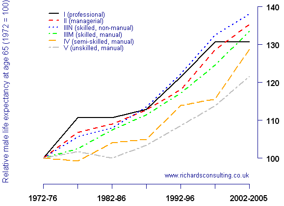
Relative increase in life expectancy in retirement by socio-economic group
All socio-economic groups have recorded large improvements in life expectancy, groups IV and V have not improved as fast as the others. The other groups predominate in annuity portfolios and defined-benefit pension schemes, however, and they have recorded increases of between 30% and 40% in life expectancy since 1972. Source: Richards Consulting calculations using data from the ONS Longitudinal Survey.
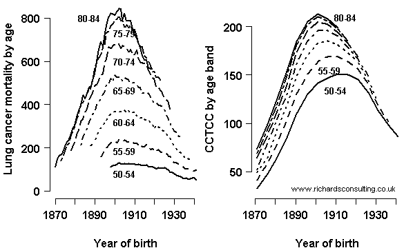
Lung-cancer rates and lifetime cigarette consumption by year of birth
The link between lung cancer and the smoking epidemic. Sources: Richards Consulting restructuring of data from Lee et al (1990), Forey et al (1993) and ONS (Twentieth Century Mortality). CCTCC = Cumulative Constant Tar Cigarette Consumption, a standardised measure of lifetime cigarette consumption, shown in units of 100,000.
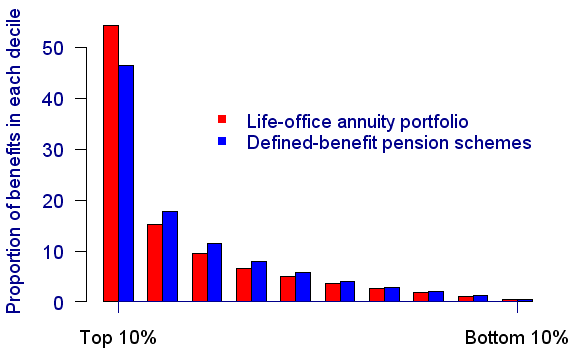
Concentration of benefits
Both annuity portfolios and defined-benefit pension schemes have tremendous concentration of risk in a relatively small number of hands. This graph shows that typically around half of all benefits are paid to just 10% of members. Source: Richards (2008).